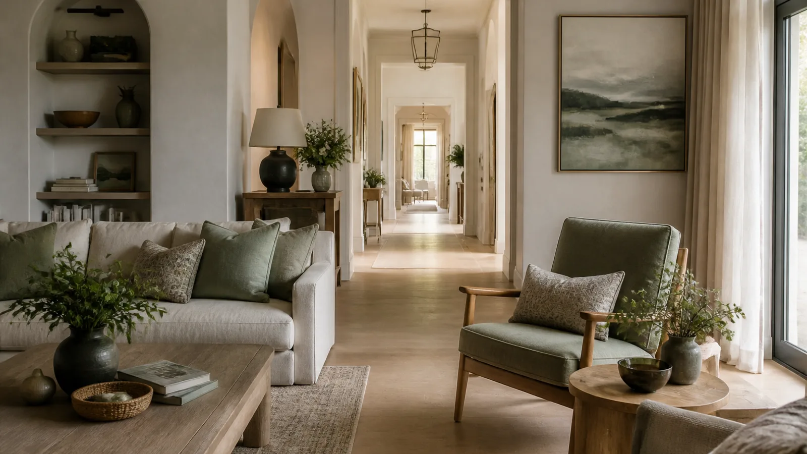
Choosing colors for one room can feel tricky. Choosing colors for your whole home can feel like a much bigger commitment, especially when hallways, open-plan spaces, bedrooms, bathrooms and existing furniture all need to work together. If you have been wondering how to choose a color palette for your home without second-guessing every paint sample, the secret is to make decisions in the right order.
A beautiful whole-home palette is not just a collection of colors you like. It needs to work with your floors, tiles, countertops, cabinets, natural light and the way rooms connect. Once you understand those pieces, color becomes less random and much more manageable.
Start with the fixed elements you are not changing
Before you save another paint color or order a sample pot, walk through your home and look at what is already there. Your fixed elements are the surfaces and pieces that are expensive, difficult or inconvenient to change.
These may include:
- Wood, stone, tile or vinyl flooring
- Kitchen cabinets and countertops
- Bathroom tile and vanities
- Fireplace surrounds
- Built-in shelving or wardrobes
- Large rugs
- Major furniture, such as sofas, beds and dining tables
- Window frames, internal doors and stair railings
These elements already have undertones. A timber floor might lean golden, orange, red, grey or ashy. A white countertop might be crisp, creamy, blue-grey or slightly green. Beige tiles can be pink-beige, yellow-beige, grey-beige or earthy taupe. Your wall colors need to cooperate with these undertones, not fight them.
Make a “do not fight this” list
Create a simple list of the fixed elements in each main area of your home. Next to each one, note what you see. Do not worry about using professional color language. Plain descriptions are enough.
- Honey oak flooring: warm, golden, slightly orange
- Cream kitchen cabinets: warm, yellow-based white
- Grey bathroom tile: cool, blue-grey
- Beige sofa: warm, oatmeal, soft
- Black metal lighting: crisp, strong contrast
If you are struggling to see undertones, use the white paper test. Hold a sheet of plain white printer paper directly against the floor, tile, countertop or fabric in natural daylight. The contrast often makes the undertone easier to spot: yellow, pink, green, blue, orange or grey. It is not a perfect science, but it gives your eye a reference point.
This list becomes your guardrail. For example, a home with honey oak floors, cream cabinets and a beige sofa will usually feel more harmonious with warm whites, soft taupes, mushroom, olive, clay or muted blues than with icy grey walls. A cool white or blue-grey might look chic on a paint card, but beside warm wood and cream cabinetry it can make everything feel slightly off.
Decide the mood before you choose the colors
Color is emotional. A pale, chalky palette can feel serene in one home and stark in another. Deep greens and browns can feel sophisticated, cosy or heavy depending on the light and furnishings. Before choosing specific shades, decide how you want your home to feel.
Pick three to five mood words. For example:
- Calm
- Fresh
- Earthy
- Cosy
- Polished
- Romantic
- Light
- Dramatic
- Relaxed
These words will help you filter your choices. If your mood words are calm, airy and soft, a high-contrast palette of black, white and scarlet probably is not the right direction. If your words are cosy, moody and grown-up, pale coastal blues may not give you the depth you want.
For example, calm and airy might translate into warm white, misty blue, pale oak, linen and soft grey-green. Cosy and moody might become mushroom, olive, rust, chocolate, aged brass and deep blue-green.
Understand your home’s natural light
Light changes everything. A paint color that looks elegant in a bright living room may look dull in a narrow hallway. A white that feels fresh in a sunny kitchen may turn cold in a shaded bedroom.
Light direction is a useful clue, although it is not a rigid rule. Trees, neighbouring buildings, window size, climate and artificial lighting all matter too.
- In the Northern Hemisphere, including the US, UK and Canada, north-facing rooms often receive cooler, softer light, while south-facing rooms are usually brighter and warmer.
- In the Southern Hemisphere, including Australia, this is broadly reversed: south-facing rooms tend to be cooler, while north-facing rooms often receive warmer, brighter light.
- East-facing rooms are usually brighter in the morning and can feel cooler later in the day.
- West-facing rooms may feel more subdued earlier and warmer or golden in the afternoon and evening.
How light direction affects palette choices
Cool, low-light rooms often need either warmth or depth. A very pale grey can look clean in a sun-filled space, but in a shaded room it may become flat and shadowy. In that case, a warm stone, soft greige, mushroom or muted green may be more forgiving.
Very sunny rooms can usually handle cooler colors or stronger saturation without feeling gloomy. A south-facing room in London or Toronto, or a north-facing room in Sydney or Melbourne, may be able to carry deeper blues, greens or charcoals beautifully.
East- and west-facing rooms need extra testing because they shift so much throughout the day. A color may look perfect at breakfast and completely different by evening.
Do not forget artificial light
Bulb temperature can change how paint reads at night. As a general guide, 2700K warm white light tends to amplify yellow, cream, red and warm wood tones. Around 3000K often feels balanced in many living areas. Cooler 4000K and above can make warm schemes look flatter and cool greys feel more clinical, depending on the room. Check your samples under the bulbs you actually use, not just in daylight.
How to choose a color palette for your home that flows
The goal is not to make every room match. It is to make your home feel connected. A whole-home palette should give each room its own character while still creating a sense of flow when you move from one space to the next.
A reliable structure is:
- One main neutral for connecting spaces, open-plan areas or the most visible walls
- One secondary neutral for bedrooms, quieter rooms or contrast
- Two or three accent colors for personality and variation
- One or two grounding colors for depth, such as charcoal, espresso, navy, deep green or black
- Consistent wood or metal tones where possible, so the palette feels intentional
Stand in your entry, hallway, living room and kitchen. What rooms can you see at the same time? These sightlines matter most. If your living room opens into the dining room, and the dining room leads to the kitchen, those colors should relate to one another. They do not need to be identical, but they should feel like part of the same conversation.
Try the doorway frame test
Stand in your main hallway, entry or open living area and look through two open doorways. You might see a hall wall, a bedroom wall and part of the living room at once. Those visible surfaces should share at least one harmonising note: the same trim color, related neutral undertones, repeated wood tones or an accent color echoed across the view.
If the view feels jumpy, the problem is often not one individual room. It is the transition between them. A connecting hallway, consistent trim color or repeated textile color can make separate rooms feel much more coherent.
Use the 60-30-10 rule, but do not be ruled by it
The 60-30-10 rule is a helpful starting point: roughly 60 percent dominant color, 30 percent supporting color and 10 percent accent. In a living room, that might mean warm white walls, a taupe sofa and sage green accents. Across a whole home, it might mean warm white as the main neutral, stone as the secondary neutral and dusty blue, olive and charcoal as accents.
Use the rule loosely. Some rooms can be quiet and tonal. Others can carry more personality. A study, powder room or dining room can be much bolder than a hallway and still feel connected if it shares an undertone, trim color, flooring or repeated accent with the rest of the house.
Choose your main neutral carefully
Your main neutral does a lot of work. It may appear in hallways, open-plan spaces, ceilings, trim or rooms that connect to several others. It does not have to be white. It could be cream, beige, taupe, greige, pale grey, soft clay or even a barely-there green.
The most important thing is undertone. A neutral is rarely just neutral. Pink undertones can clash with yellow stone or orange-toned wood. Blue-grey can feel crisp in bright light and chilly in shade. Cream can look elegant beside warm materials but too yellow beside a brilliant white. Green undertones can be sophisticated, but in some rooms they may turn muddy.
Always compare your neutral against fixed elements, not just against a white piece of paper or a paint chart. The question is not “Do I like this color?” It is “Does this color make my floors, cabinets, tiles and furniture look better?”
White paint is not automatically the safest choice
White sounds simple, but it is one of the easiest colors to get wrong. Brilliant white can be beautiful in a modern, light-filled space with clean finishes. In an older home with cream cabinets, beige carpet or warm stone, it can make those finishes look yellowed or tired.
If your kitchen cabinets are creamy white, stark white walls may make the cabinets appear more yellow. A warm off-white, soft ivory or pale stone may look more intentional. The same applies to trim and ceilings. Test those whites with your wall color, not in isolation.
Create room-to-room flow with repeat colors
Repetition is what makes a palette feel designed rather than accidental. Once you choose your colors, repeat them in different ways throughout the home.
A color can appear as:
- Wall paint
- Cushions or throws
- Artwork
- Cabinetry
- Rugs
- Bedding
- Lampshades
- Tile
- Doors or trim
If your palette includes sage green, it might appear as kitchen stools, living room cushions and a bedroom throw. If your grounding color is charcoal, you might use it in picture frames, a bathroom vanity and door hardware. The repetition can be subtle; it simply helps the eye understand that the rooms belong together.
Use stronger colors in contained spaces
Bold colors often work best in rooms with clear boundaries: powder rooms, studies, dining rooms, guest bedrooms and small dens. These spaces can be more dramatic because you are not seeing the color everywhere at once.
The key is to connect the bold room to the rest of the home. A deep aubergine powder room can work in a soft neutral house if it relates to plum artwork in the hallway, warm stone flooring and aged brass fixtures. A navy study can feel cohesive if navy appears again in a rug, cushion or piece of art elsewhere.
Example whole-home palettes for different moods
You do not need to copy these exactly. Use them as starting points and adjust for your fixed elements, light and personal style.
Calm and airy
- Warm white
- Soft linen beige
- Misty blue
- Pale oak
- Gentle grey-green
Use warm white in main living areas, linen in bedrooms, misty blue or grey-green in bathrooms or textiles, and pale oak through flooring or furniture. This palette works well when you want softness without everything feeling plain.
Earthy and relaxed
- Mushroom
- Clay
- Olive
- Cream
- Dark bronze or espresso
Use mushroom or cream as the base, olive for upholstery or cabinetry, clay in textiles or a dining room, and dark bronze or espresso for grounding. This palette is especially friendly to warm woods, stone, terracotta and natural textures.
Classic and polished
- Soft white
- Warm greige
- Navy
- Camel
- Charcoal
Use soft white walls, greige in hallways or bedrooms, navy in a study or main bedroom, camel through leather or wood tones, and charcoal for hardware, frames or accent furniture. It feels tailored without being severe.
Fresh and modern
- Chalky white
- Pale grey-beige
- Black
- Eucalyptus green
- Light walnut
Keep the walls clean and restrained, use black for contrast, add eucalyptus green for softness and bring in walnut to stop the scheme feeling sterile. This palette suits homes with simple lines and good natural light.
Romantic and cosy
- Cream
- Dusty rose
- Plum
- Taupe
- Antique brass
Use cream or taupe as the base, dusty rose in bedrooms or textiles, plum in a small room or accent pieces, and antique brass for warmth. This palette can feel grown-up and intimate when the colors are muted rather than sugary.
A quick note on paint finish
Color is only part of the decision. Finish affects how a color looks and how practical it is. Product names vary by country and brand, so always check the paint label, but as a general guide:
- Flat or matte finishes can look soft and elegant on low-traffic walls and ceilings, but may be less forgiving in busy family spaces.
- Eggshell or satin finishes are often practical for living areas, hallways and children’s rooms because they tend to be easier to wipe.
- Semi-gloss or gloss finishes are commonly used on trim, doors and cabinetry because they add durability and definition.
- Kitchens and bathrooms may need finishes designed for moisture and frequent cleaning.
The same color can look slightly deeper, brighter or more reflective in a higher sheen, so test finish as well as shade when the room matters.
Test samples properly before committing
Paint chips are useful for narrowing your choices, but they are not enough. Colors need to be tested at scale, in your home, with your light and your existing finishes.
Use sample pots or large peel-and-stick samples where available. Paint large boards rather than tiny squares directly on the wall. Move the boards around the room and into adjoining spaces. View them vertically, because that is how the color will sit on the wall. Check them in the morning, afternoon, evening and under artificial light.
The best places to test color
- Next to trim and doors
- Beside flooring
- Near windows
- In shadowed corners
- Against kitchen cabinets or bathroom tile
- Near major furniture, such as sofas and beds
- In hallways or connecting spaces where colors need to flow
A beige sample may look perfect by the window but turn pink beside a grey sofa or peach beside terracotta tile. A white may look fresh in daylight and harsh under evening bulbs. Testing in several places gives you a much clearer answer before you buy gallons or litres of paint.
The best color is not the one that looks prettiest on the card. It is the one that still looks good beside your floors, furniture, trim and light at the end of the day.
Common mistakes when choosing a home color palette
Most color regrets come from skipping a step. Watch out for these common mistakes:
- Choosing paint first. Paint is easier to change than flooring, tile, cabinetry or a sofa.
- Ignoring undertones. This is why colors that seem neutral can suddenly look pink, yellow, green or blue.
- Copying a professionally photographed home. The light, editing, architecture and finishes may be completely different from yours.
- Using too many unrelated accents. A palette needs variety, but it also needs restraint.
- Choosing every room in isolation. Rooms should have some relationship to the spaces around them.
- Forgetting hallways, ceilings, trim and doors. These surfaces affect the whole scheme.
- Testing only at midday. Morning, evening and artificial light can change the color dramatically.
- Assuming neutrals are easy. Neutrals often have the most troublesome undertones.
- Putting trendy colors on permanent finishes. It is safer to use trends on paint, textiles and accessories than expensive surfaces.
What to do if your current colors do not work together
If something feels wrong, identify the clash before buying more décor. Is the problem the wall color, the sofa, the rug, the bulbs, the flooring or the tile? Sometimes a small adjustment makes a big difference.
If a cool grey sofa clashes with warm beige walls, bridge the two with mushroom, charcoal, muted blue or patterned textiles that include both warm and cool notes. If a room feels too yellow at night, try adjusting the warmth of the light bulbs before repainting. If the undertone clash is strong, repainting the wall may be the simplest and most effective fix.
A simple step-by-step method
Use this checklist before committing to a whole-home palette:
- Photograph each room in natural light.
- List your fixed elements and their undertones.
- Choose three to five mood words for your home.
- Note the light direction and any rooms that feel especially dark or bright.
- Select one main neutral.
- Add one secondary neutral.
- Choose two or three accent colors.
- Pick one or two grounding colors.
- Map colors to rooms based on sightlines.
- Repeat key colors in different ways throughout the home.
- Choose suitable paint finishes for walls, trim and moisture-prone rooms.
- Test large samples for several days.
- Finalise trim, ceiling and door colors.
- Buy paint only after testing it in the rooms where it will be used.
FAQ
How many colors should a whole-home palette have?
Most homes feel cohesive with one main neutral, one secondary neutral, two or three accent colors and one or two deeper grounding shades. You can use different amounts of each color in different rooms so the home feels connected but not repetitive.
Should every room in my home be the same color?
No. Repeating one or two key colors can create flow, but every room does not need to match. A good palette feels related from room to room while still allowing bedrooms, bathrooms and smaller spaces to have their own mood.
What is the safest neutral for a whole home?
There is no universal safest neutral. Warm whites, soft greiges, pale taupes and gentle off-whites are often flexible, but the right choice depends on your flooring, cabinetry, furniture and light. Always test neutrals beside your fixed finishes.
How do I know if a paint color has the wrong undertone?
It may make nearby finishes look dirty, too yellow, too pink, too green, too orange or overly grey. If the color looks fine on its own but strange beside your floors, cabinets, tile or sofa, the undertone is probably the issue.
Should I choose paint or furniture first?
If you are starting from scratch, choose the direction for major furniture, flooring and cabinetry before final paint. Paint is usually easier and less expensive to adjust than a sofa, tile, countertop or wood floor.
Conclusion
Learning how to choose a color palette for your home is less about finding one perfect shade and more about building a system that supports the way you live. Start with what you cannot easily change, pay attention to undertones and natural light, create flow with repeated colors, and test samples properly before committing.
The best whole-home palettes are consistent without being flat. They give your rooms connection, character and enough flexibility to evolve over time.






Join the conversation
Sign in — Sign in to join the conversation.