
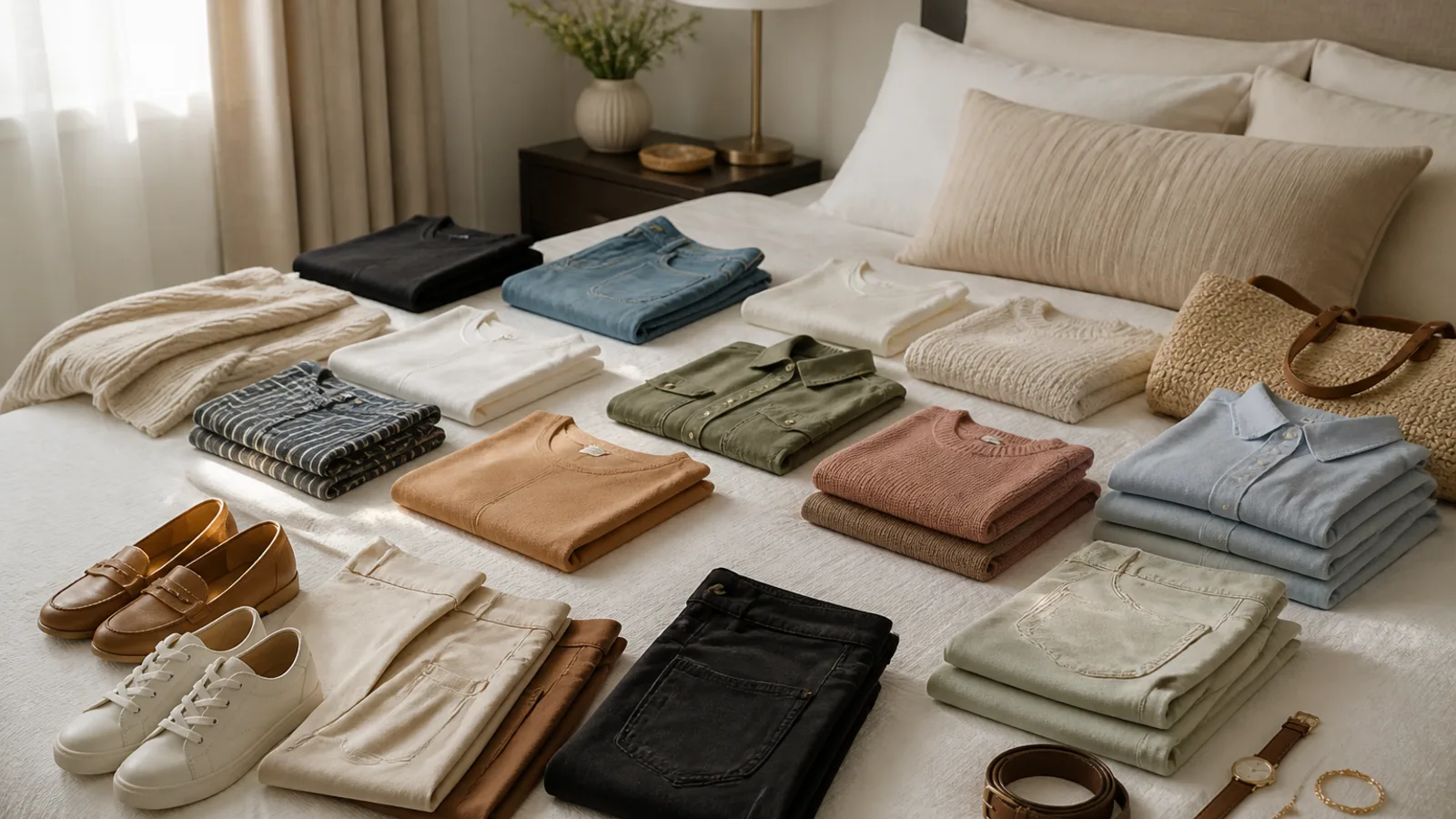
If you’ve ever tried to build a capsule wardrobe and ended up with a closet full of “good basics” you still don’t wear, the problem may not be the number of pieces. It may be the capsule wardrobe color palette.
Most capsule advice starts with a tidy list of neutrals and a promise that everything will mix with everything. In real life, though, what you wear depends on your routine, your laundry habits, your climate, your work life, and the colors that make you feel most like yourself. A great palette is not the “correct” one. It’s the one you’ll actually repeat without overthinking.
Here’s how to choose a practical 3–5 color palette that fits your real wardrobe, not an idealized one.
Start with your life, not with a color chart
Before you pick any shades, look at how you live. A wardrobe that works for someone who washes clothes every few days will look different from one built for weekly laundry. Someone in a corporate office will need different color relationships than someone working from home, in a creative field, or in a warm climate where lighter fabrics get worn constantly.
Ask yourself what your clothes need to do most days. Do you want them to look polished with minimal effort? Do you need them to hide spills, hold up to frequent washing, or layer easily under jackets? Do you prefer calm outfits or high-contrast ones? Those answers matter more than any preset palette.
A useful capsule wardrobe color palette should reduce friction. If getting dressed still feels complicated, the palette is probably too broad, too delicate to maintain, or too far from what you actually reach for.
Audit the colors you already wear
The fastest way to choose a palette is to look at what is already doing the work in your closet. Pull out your most-worn items from the last month or two. Not the clothes you meant to wear, but the ones you actually did wear.
Look for patterns. Which colors keep showing up? Which shades do you instinctively buy again? Which ones make it onto your body without debate?
You may notice that your wardrobe already has a clear direction:
- mostly cool neutrals like black, grey, navy, and white
- warm earth tones like camel, olive, cream, and brown
- soft muted color like dusty blue, sage, or blush
- bold contrast like black, white, red, or cobalt
That pattern is valuable. It tells you what feels natural, not just aspirational.
Now look at the colors you own but rarely wear. Sometimes the reason is practical: the fabric is high-maintenance, the shade clashes with your favorite shoes, or it’s too light for your lifestyle. Sometimes it’s personal: the color looks beautiful on the hanger but feels wrong near your face.
One helpful question is this: Would I buy this color again if I saw it today? If the answer is no, it may not belong in your core palette.
Choose your anchor neutrals first
Neutrals are the backbone of a capsule wardrobe because they make repetition easier. But “neutral” does not have to mean black, white, and grey. The best neutrals are the ones that blend with the clothes you wear most often and the maintenance you’re willing to handle.
Common neutral directions include:
- black, white, and grey
- navy, cream, and camel
- charcoal, ivory, and taupe
- espresso, stone, and oat
If you want a wardrobe that feels clean and modern, black and white can be powerful anchors. If you prefer softer contrast, navy, cream, and camel often feel more wearable and less harsh. If you like warmth, taupe, oat, and chocolate can create a gentle, cohesive base.
It also helps to think about laundry and wear-and-tear. Light neutrals can look fresh and crisp, but they may show marks more quickly. Dark neutrals can be easier to keep looking tidy, but they may fade, attract lint, or feel too severe in some fabrics. Mid-tones are often the easiest middle ground for everyday life.
If you’re unsure, choose one main neutral and one supporting neutral first. For example, navy plus cream, or black plus grey, or camel plus ivory. You can always add a third later if your closet needs it.
Build the capsule wardrobe color palette around one mood
Many people try to include every color they like. That usually creates a wardrobe that looks nice individually but doesn’t feel connected as a whole. Instead, choose one mood and let the palette support it.
The soft and quiet palette
This works well if you prefer calm, understated outfits with low contrast. Think of wardrobes that look polished without shouting for attention.
Example palette: navy, ivory, taupe, dusty blue, soft sage.
Why it works: the colors are gentle, easy to layer, and flattering for people who like a softer visual effect. It’s a good choice if you want your clothes to feel refined and relaxed at the same time.
The warm and natural palette
This is ideal if you gravitate toward cozy textures, denim, boots, and earthy layers. It often feels grounded and easy to wear in casual settings.
Example palette: camel, cream, chocolate, olive, rust.
Why it works: the shades connect naturally with each other, especially in knitwear, denim, leather, and relaxed tailoring. If you prefer warm metals, organic fabrics, and a less polished look, this palette can feel very natural.
The bold but wearable palette
If you love color but still want cohesion, a stronger palette can work beautifully. The key is to keep the number of colors small enough that they still feel intentional.
Example palette: black, white, denim blue, red, cobalt.
Why it works: there’s enough contrast to feel lively, but the palette still has structure. A bold wardrobe does not have to be chaotic. It just needs repeated anchors.
You can also adjust the mood by changing the intensity. For example, a “bold” palette can be bright and graphic, or it can be rich and saturated without being loud.
Use complexion preferences as a guide, not a rulebook
Color advice can get overly rigid very quickly. You do not need a perfect season analysis to choose a wardrobe that looks and feels good. What matters most is whether the color makes you feel more awake, more comfortable, or more like yourself.
When you try colors near your face, notice whether they make your skin look rested, clear, and bright. Some colors do this naturally. Others may drain you, make you look washed out, or feel oddly disconnected from your features.
That said, “flattering” is not the only test. Personal preference matters too. Some people love high-contrast dressing even if they do not wear soft shades especially well. Others prefer a muted look because it feels more elegant or familiar.
If you love a color that does not seem ideal near your face, do not ban it completely. Move it farther away from your face as a skirt, trousers, shoes, bag, or outer layer. That way, you can still enjoy the color without forcing it into every top or dress.
The best wardrobe colors are not the ones you’re told to wear. They’re the ones you keep reaching for because they make getting dressed easier.
Make your palette work with your laundry habits
This is the part many capsule wardrobe guides skip, but it matters. If your laundry routine is weekly, your color palette needs to survive more wear between washes. If you wash frequently, you can be a little more flexible.
Ask yourself how often you realistically wash your clothes, and what happens in between. Do you rewear tops? Do you hang items to air out? Do you prefer pieces that can be washed together without sorting everything into separate piles?
Color choice affects maintenance more than people expect.
- Light colors can look fresh but may need more careful laundering.
- Dark colors hide some marks, but may show lint or fade unevenly depending on the fabric and dye quality.
- Mid-tones are often the most forgiving for regular wear.
- High-contrast whites can be crisp, but they are not always low effort.
If you know you dislike high-maintenance laundry, it is smart to lean into shades that age gracefully. That may mean fewer bright whites, fewer ultra-pale colors, or fewer very dark pieces in fabrics that fade quickly.
Use a simple 3–5 color formula
You do not need a huge palette to build a flexible wardrobe. In fact, a smaller palette often makes styling easier.
A practical formula looks like this:
- Choose 1–2 core neutrals.
- Add 1 main accent color.
- Add 1 supporting color.
- Optional: add 1 statement color or print.
That gives you enough variety to feel flexible, without making every outfit feel random. The goal is harmony, not perfection.
Here’s how the roles usually break down:
- Bottoms: usually work best in neutrals
- Outerwear: often looks strongest in a core neutral
- Tops: are the easiest place to add color
- Accessories: can carry bolder shades
- Prints: should ideally include at least one palette color
If you like prints, use them strategically. A striped shirt, floral blouse, or checked scarf can make a palette feel richer without adding too many new colors.
Let your existing wardrobe lead the way
The most practical palette is usually the one that fits your current wardrobe, not the one you wish you had from scratch. If you already own a strong pair of navy trousers, a camel coat, and a few cream tops, that is a clue. Build around what is already connected.
Start with the category you wear most. For some people, that’s tops. For others, it’s trousers, dresses, or jackets. Choose the colors that connect the largest number of items you already own.
This approach also keeps you from replacing everything at once. You can phase in new pieces slowly, making sure each addition earns its place. That’s usually more realistic and more sustainable than a full closet reset.
And yes, it is fine to keep a few non-matching favorites. If a piece is special, seasonal, or worn in a simple way that does not need much coordination, it can still deserve a spot. A wardrobe should be useful, but it should still include joy.
Examples of practical capsule wardrobe color palettes
If you want a starting point, these sample palettes can help you think in combinations rather than individual colors.
Office-friendly and easy to repeat
Palette: navy, cream, grey, black, soft blue
This works well if you need outfits that feel professional, calm, and easy to mix. It gives you enough variety to avoid boredom, while keeping the overall look polished.
Warm, relaxed, everyday dressing
Palette: camel, ivory, olive, chocolate, rust
This is a strong choice for casual wardrobes, knitwear, denim, and natural textures. It feels grounded and easygoing, with enough warmth to feel inviting.
Color lover, but still organized
Palette: navy, white, red, cobalt, denim blue
This palette gives you energy and contrast without turning your closet into a rainbow. It works especially well if you like crisp shapes, graphic stripes, and statement pieces that still mix.
Soft and feminine
Palette: taupe, pearl, dusty rose, sage, soft navy
This feels gentle without being overly sweet. It suits people who like muted color, subtle contrast, and a more romantic look.
Common mistakes to avoid
Even a well-intentioned capsule wardrobe color palette can go wrong if it becomes too abstract. A few common mistakes are worth avoiding.
- Choosing too many colors. The wardrobe starts to feel busy and harder to coordinate.
- Picking colors you admire but never wear. Inspiration is not the same as daily use.
- Forgetting shoes, bags, and outerwear. These items affect cohesion more than many people realize.
- Building a palette that looks great online but not in your closet. Screen lighting and styling tricks can be misleading.
It also helps not to overthink the “perfect” shade. A slightly warmer or cooler version of the same color may work just as well if it fits your wardrobe better.
Do a final reality check before you commit
Before you start buying around a palette, test it against real life. Can you make most of your outfits from these colors without forcing combinations? Do they work with your most-used shoes and bags? Can you keep them looking good with your actual laundry routine?
Most importantly, ask whether the palette supports the mood you want to wear most days. If you want to feel calm, polished, easygoing, or bold, your colors should reinforce that feeling.
A capsule wardrobe color palette should not make your closet feel restrictive. It should make it simpler to choose clothes you already like, wear them more often, and stop second-guessing every outfit.
FAQ
How many colors should be in a capsule wardrobe color palette?
For most people, 3 to 5 colors is a practical range. That usually gives you enough variety to feel flexible, without making the wardrobe harder to coordinate. You can always add a sixth color later if it truly works with the rest of the palette.
Can I include black and navy in the same capsule wardrobe?
Yes. The old rule that black and navy should never be mixed is far too strict. They can work beautifully together if the rest of the wardrobe supports them. The key is to repeat both colors intentionally, rather than treating one as an accident.
What if I love bright colors but want a minimal wardrobe?
Keep the base of your wardrobe neutral, then use bright color as your accent. That might mean one strong top, a scarf, shoes, a bag, or one standout dress. A minimal wardrobe does not have to be colorless.
Should my capsule wardrobe color palette change by season?
It can, but it does not have to. Some people keep the same core palette year-round and shift only the fabric weight and proportion of each color. Others use a lighter summer version and a deeper winter version. Either approach can work if it stays easy to mix.
How do I choose a palette if I already own a lot of different colors?
Start by identifying the colors you wear most and the ones that link the largest number of outfits. Then narrow your focus to the shades that feel most natural together. You do not need to eliminate everything else at once. Let the new palette emerge from your actual wardrobe, piece by piece.
The best capsule wardrobe color palette is the one that fits your life, your laundry routine, your existing clothes, and the colors you genuinely enjoy wearing. When your palette is built around real habits instead of perfect theory, getting dressed becomes simpler, faster, and much more satisfying.




Join the conversation
Sign in — Sign in to join the conversation.